library(tidyverse)
library(ggforce)
# library(tidylog)
# Set the default font to be a bit larger:
theme_set(theme_gray(base_size = 18))25 R Graphics Exercises
25.1 Acknowledgments
Portions of this are from
https://datacarpentry.org/R-ecology-lesson/instructor/04-visualization-ggplot2.html
All Data Carpentry instructional material is made available under the Creative Commons Attribution license. Copyright (c) Data Carpentry.
Link: https://datacarpentry.org
Accordingly, this chapter is also licensed using the CC-BY 4.0 license. https://creativecommons.org/licenses/by/4.0/
25.2 The Grammer of Graphics
This slide set by Garrick Aden-Buie provides a nice introduction to plotting with ggplot2:
A Gentle Guide to the Grammer of Graphics with ggplot2
25.3 Load Libraries
25.4 Download example data
25.5 Exercise 1
Read in and set up the data set b, a cleaned version of our simulated data set:
Introduction from Data Carpentry
Plotting with ggplot2
ggplot2 is a plotting package that provides helpful commands to create complex plots from data in a data frame. It provides a more programmatic interface for specifying what variables to plot, how they are displayed, and general visual properties. Therefore, we only need minimal changes if the underlying data change or if we decide to change from a bar plot to a scatterplot. This helps in creating publication quality plots with minimal amounts of adjustments and tweaking.
Use long format data
ggplot2 plots work best with data in the ‘long’ format, i.e., a column for every variable, and a row for every observation. Well-structured data will save you lots of time when making figures with ggplot2
Build layer by layer
ggplot graphics are built layer by layer by adding new elements. Adding layers in this fashion allows for extensive flexibility and customization of plots.
Basic template
To build a ggplot, we will use the following basic template that can be used for different types of plots:
ggplot(data = <DATA>, mapping = aes(<MAPPINGS>)) + <GEOM_FUNCTION>()Notes
- Anything you put in the
ggplot()function can be seen by any geom layers that you add (i.e., these are universal plot settings). This includes the x- and y-axis you set up inaes(). - You can also specify aesthetics for a given geom independently of the aesthetics defined globally in the
ggplot()function. - The + sign used to add layers must be placed at the end of each line containing a layer. If, instead, the + sign is added in the line before the other layer, ggplot2 will not add the new layer and will return an error message.
- You may notice that we sometimes reference
ggplot2and sometimesggplot. To clarify,ggplot2is the name of the most recent version of the package. However, any time we call the function itself, it’s just calledggplot().
Key Points
- Start simple and build your plots iteratively.
- The
ggplot()function initiates a plot. - Use
aes()when mapping a variable from the data to a part of the plot geom_functions add representations of your data.- Use
facet_to partition a plot into multiple plots based on a factor included in the dataset.
Additional Points
These points are not illustrated here in this current exercise:
- Use premade
theme_functions to broadly change appearance, and thetheme()function to fine-tune - The
patchworklibrary can combine separate plots into a single figure - Use
ggsave()to save plots in your favorite format and dimensions
See <https://datacarpentry.org/R-ecology-lesson/instructor/04-visualization-ggplot2.html for further details.
Starting with the data set b, use ggplot’s framework
ggplot(data = <DATA>, mapping = aes(<MAPPINGS>)) + <GEOM_FUNCTION>()to plot ind vs. t, coloring by case-control status (trait). What do you observe about the data?
Expand to see solution
25.6 Facetting
Facetting can be done using the classic interface, where formula notation is used to indicate rows (before the ~) and columns (after the ~). According to the facet_grid documentation
“the dot in the formula is used to indicate there should be no faceting on this dimension (either row or column)”
So this will facet in columns by geno:
facet_grid(~ geno)This will facet in rows by geno:
facet_grid(geno ~ .)25.7 Exercise 2
Using ggplot, plot ind vs. t, coloring by case-control status (trait) and faceting by geno. What do you observe about the data?
Expand to see solution
25.8 Faceting, continued
The current recommended notation for facetting instead clearly names the rows and columns that you’d like to facet on.
This will facet in columns by geno:
facet_grid(cols = vars(geno))This will facet in rows by geno:
facet_grid(rows = vars(geno))Try these various ways of facetting out.
Expand to see solution
25.9 Always plot your data
25.10 Similar regression lines
These three data sets have very similar regression lines:
summary(lm(x ~ y, data=d)) %>% coef() Estimate Std. Error t value Pr(>|t|)
(Intercept) 56.17563819 2.87986960 19.5063131 9.435087e-42
y -0.03991951 0.05250204 -0.7603419 4.483288e-01summary(lm(x_1 ~ y_1, data=d)) %>% coef() Estimate Std. Error t value Pr(>|t|)
(Intercept) 56.31108156 2.87906158 19.5588319 7.158847e-42
y_1 -0.04269949 0.05249244 -0.8134407 4.173467e-01summary(lm(x_3 ~ y_3, data=d)) %>% coef() Estimate Std. Error t value Pr(>|t|)
(Intercept) 56.18271411 2.87924135 19.5130270 9.107718e-42
y_3 -0.04012859 0.05249468 -0.7644316 4.458966e-01ggplot(d,aes(x=x,y=y)) + geom_point() +
geom_smooth(method="lm") + ggtitle("Linear regression of y ~ x")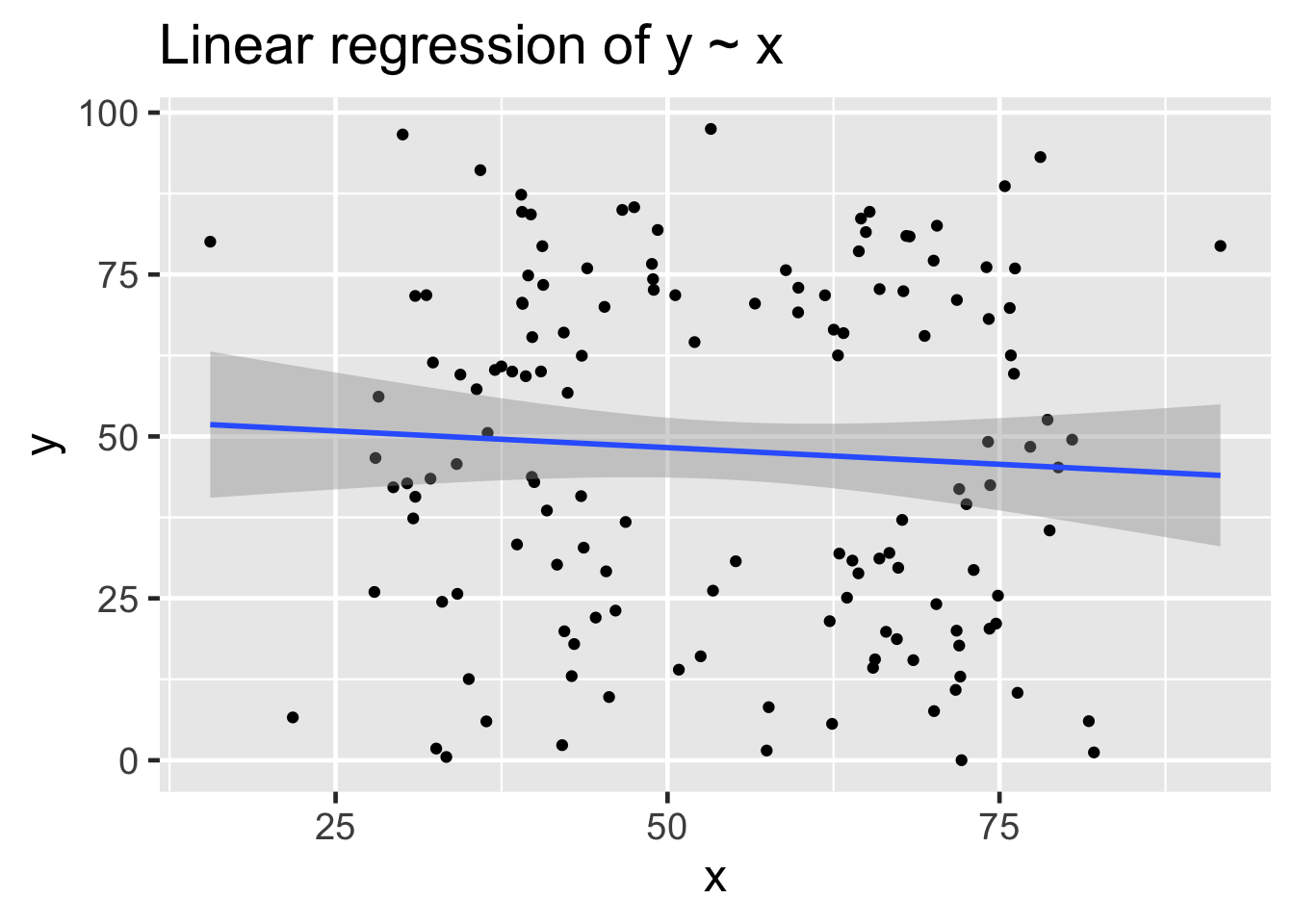
Now try this:
Expand to see solution
And now try this:
Expand to see solution
25.10.1 Always plot your data!
25.11 Always plot your data
Stacking vectors concatenates multiple vectors into a single vector along with a factor indicating where each observation originated.
Now try this:
Expand to see solution
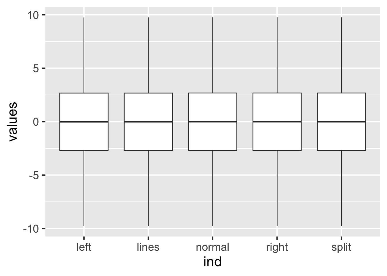
25.12 Identical box plots
These data have essentially identical box plots.
25.13 Boxplots
While the box plots are identical, box plots may not tell the whole story.
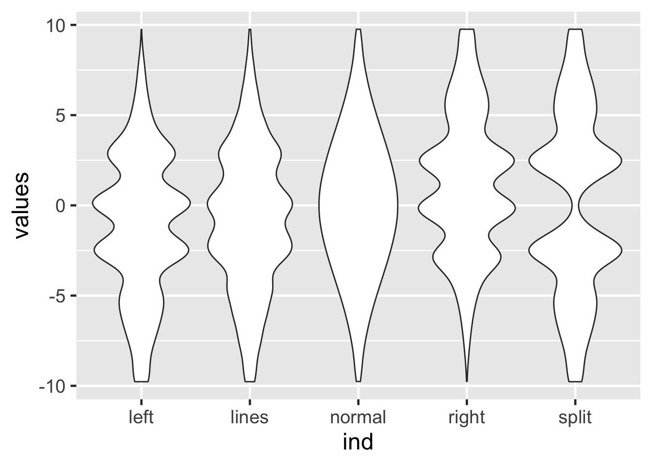
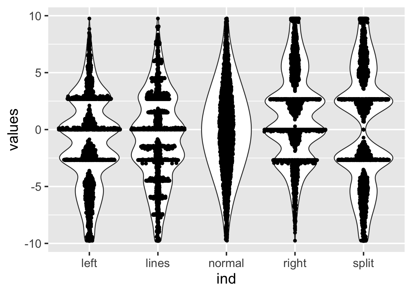
Let’s try violin plots instead:
A violin plot is a mirrored density plot.
Expand to see solution
25.14 Non-identical violin plots
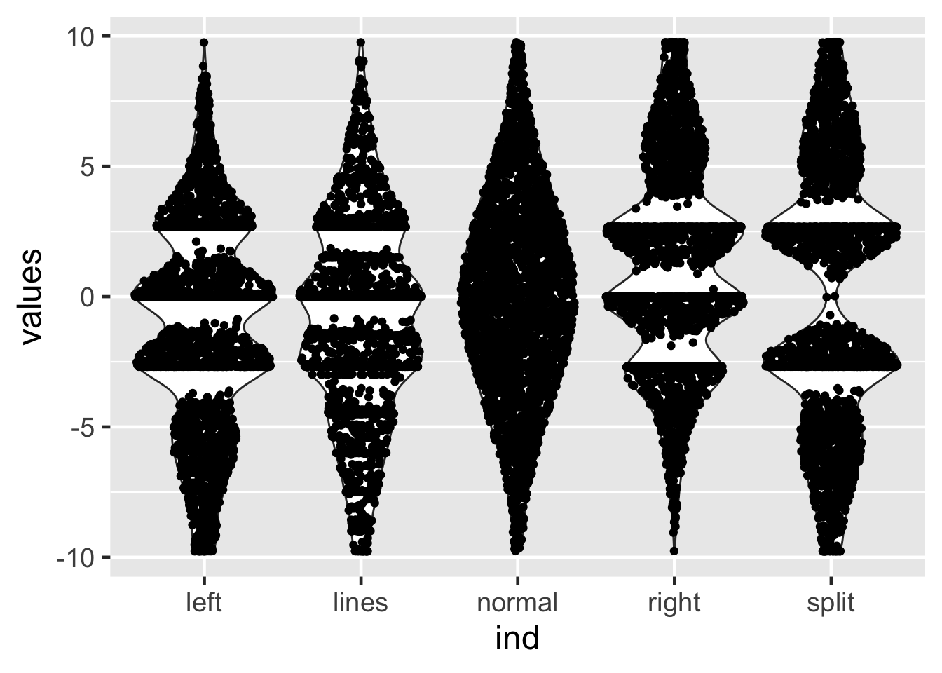
25.15 Sina plots
Sidiropoulos N, Sohi SH, Pedersen TL, Porse BT, Winther O, Rapin N, Bagger FO. SinaPlot: An Enhanced Chart for Simple and Truthful Representation of Single Observations Over Multiple Classes. Journal of Computational and Graphical Statistics. Taylor & Francis; 2018 Jul 3;27(3):673–676. DOI: https://doi.org/10.1080/10618600.2017.1366914
Expand to see solution
25.16 Sina plots
25.17 Sina plots
method == "counts": The borders are defined by the number of samples that occupy the same bin.
Expand to see solution
25.18 Sina plots
25.19 Raincloud plots
Raincloud plots can be created by using the geom_rain geometry from the ggrain R package.
“These”raincloud plots” can visualize raw data, probability density, and key summary statistics such as median, mean, and relevant confidence intervals in an appealing and flexible format with minimal redundancy.”
Allen M, Poggiali D, Whitaker K, Marshall TR, Van Langen J, Kievit RA. Raincloud plots: a multi-platform tool for robust data visualization. Wellcome Open Res. 2021 Jan 21;4:63. PMID: 31069261 PMCID: PMC6480976 DOI: https://doi.org/10.12688/wellcomeopenres.15191.2
https://github.com/RainCloudPlots/RainCloudPlots
Try it out, using geom_rain()
Expand to see solution
25.20 Drawing multiple graphs
Sometimes we’d like to draw multiple plots, looping across variables. Doing this within an R Markdown or Quarto Markdown document using ggplot2 is tricky. See https://dplyr.tidyverse.org/articles/programming.html and https://r4ds.hadley.nz/functions.html#plot-functions for details.
Here’s one way to do this - this example code will generate two scatter plots:
25.21 Writing ggplot functions
25.21.1 Data-variables vs. env-variables
When writing ggplot functions, it is important to understand the distinction between data-variables and env-variables.
See https://dplyr.tidyverse.org/articles/programming.html#data-masking where they explain that:
- env-variables are “programming” variables that live in an environment. They are usually created with
<-.
- data-variables are “statistical” variables that live in a data frame. They usually come from data files (e.g. .csv, .xls), or are created manipulating existing variables.
When you have the data-variable in a function argument (i.e. an env-variable that holds a promise), you need to embrace the argument by surrounding it in doubled braces, like
filter(df, {{ var }})
25.21.2 Example function
Note that here we are going to use the very flexible ... function argument.
See http://adv-r.had.co.nz/Functions.html for a detailed description of how this function argument works. In brief, they explain that:
There is a special argument called
.... This argument will match any arguments not otherwise matched, and can be easily passed on to other functions. This is useful if you want to collect arguments to call another function, but you don’t want to prespecify their possible names.
See also https://r4ds.hadley.nz/functions.html#plot-functions
Example from: https://twitter.com/yutannihilat_en/status/1574387230025875457?s=20&t=FLbwErwEKQKWtKIGufDLIQ
25.22 Exercise 3
Consider this example code:
From: https://twitter.com/hadleywickham/status/1574373127349575680?s=20&t=FLbwErwEKQKWtKIGufDLIQ
When applied to the quantitative trait t from the data frame b, this generates this histogram:
25.22.1 Exercise
After reading the example above, extend the histogram function to allow facetting and use it to draw a histogram of the quantitative trait t facetted by geno using the data set b that we set up above.
Hints
- See https://r4ds.hadley.nz/functions.html#plot-functions
- Use the
vars({{ var }})approach
Expand to see solution
Hadley Wickham states:
You have to use the vars() syntax
foo <- function(x) {
  ggplot(mtcars) +
    aes(x = mpg, y = disp) +
    geom_point() +
    facet_wrap(vars({{ x }}))
}
The vars() function is used for quoting faceting variables. The help page for vars() says:
“Just like aes(), vars() is a quoting function that takes inputs to be evaluated in the context of a dataset. These inputs can be:
- variable names
- complex expressions
In both cases, the results (the vectors that the variable represents or the results of the expressions) are used to form faceting groups.”
Tweet: https://twitter.com/hadleywickham/status/1574380137524887554?s=20&t=FLbwErwEKQKWtKIGufDLIQ
25.23 Source of data
Illustrative data sets from https://www.research.autodesk.com/publications/same-stats-different-graphs/